



blending tradition and innovation into a fresh brand identity
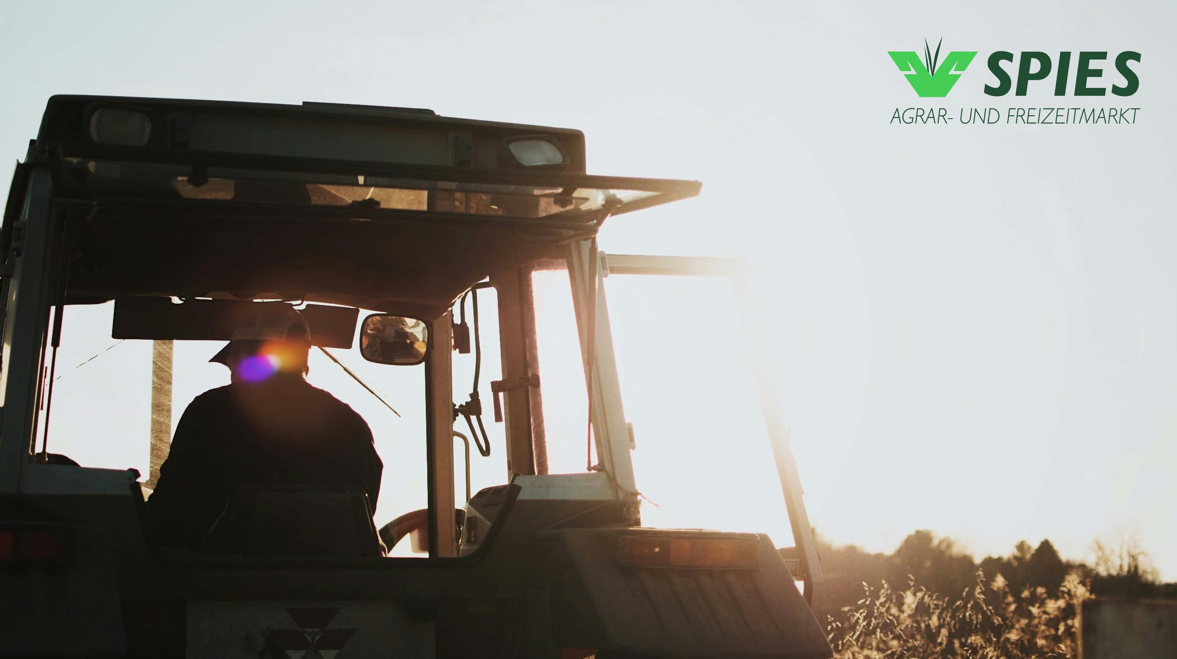
Hans Spies is a family-run agricultural business with deep-rooted traditions, guided by the philosophy: "The best things are closer than you realize." Passed down through generations, the company specializes in products not only for agriculture but also for home and garden, combining heritage with practical solutions.
(strategy)
During a discovery workshop, we explored benchmarks, potential target audiences, and envisioned the brand as a person. We developed brand filters and defined key personas, shaping a clear identity for Hans Spies, one rooted in authenticity, reliability, and professionalism. Our goal was to reflect these qualities through a design that feels natural, friendly, and emotionally engaging, all while maintaining the brand’s rich, cross-generational tradition.
Branding
UI Design
Design System
(mood)
Authentic
Caring
Human
(design)
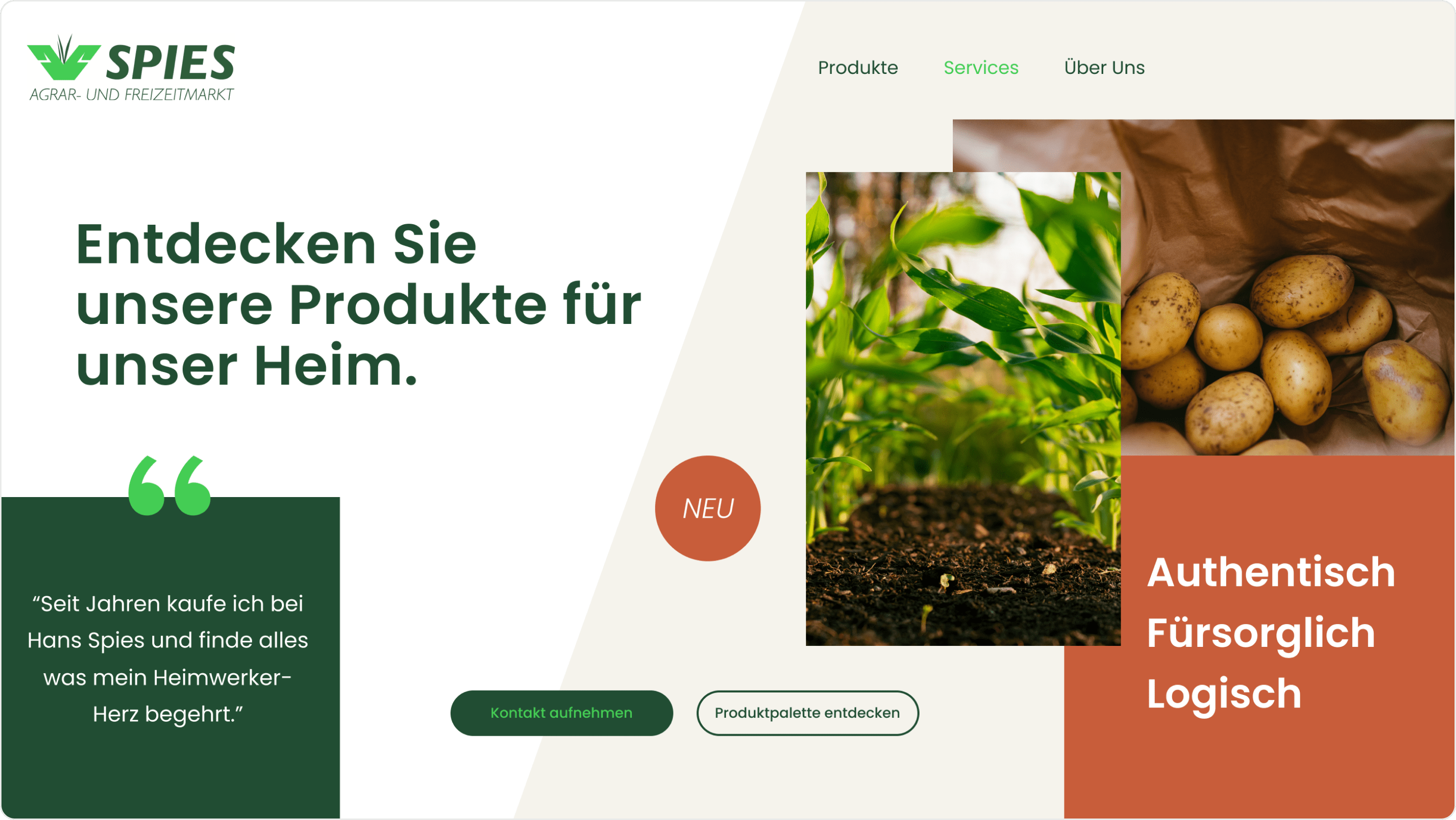
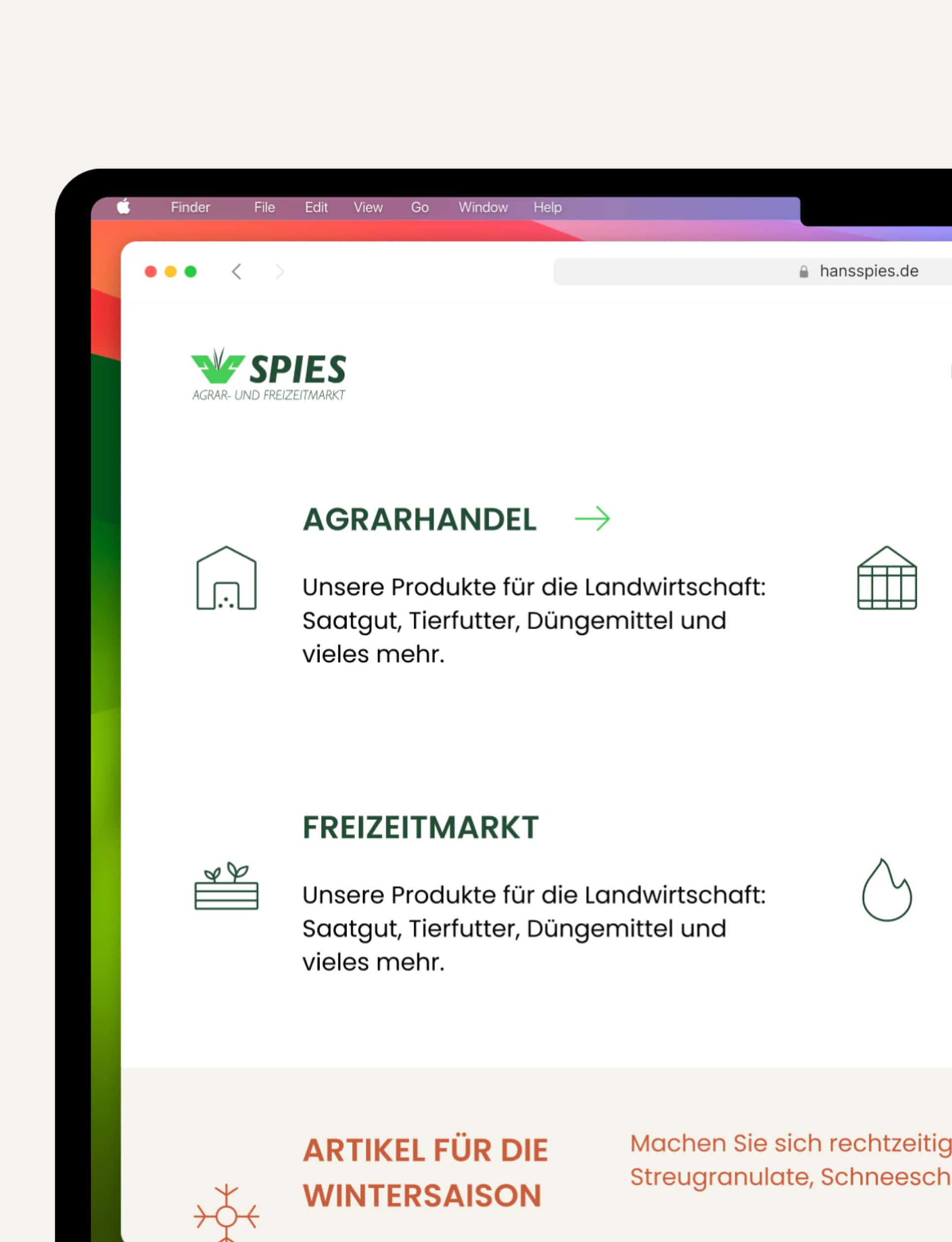
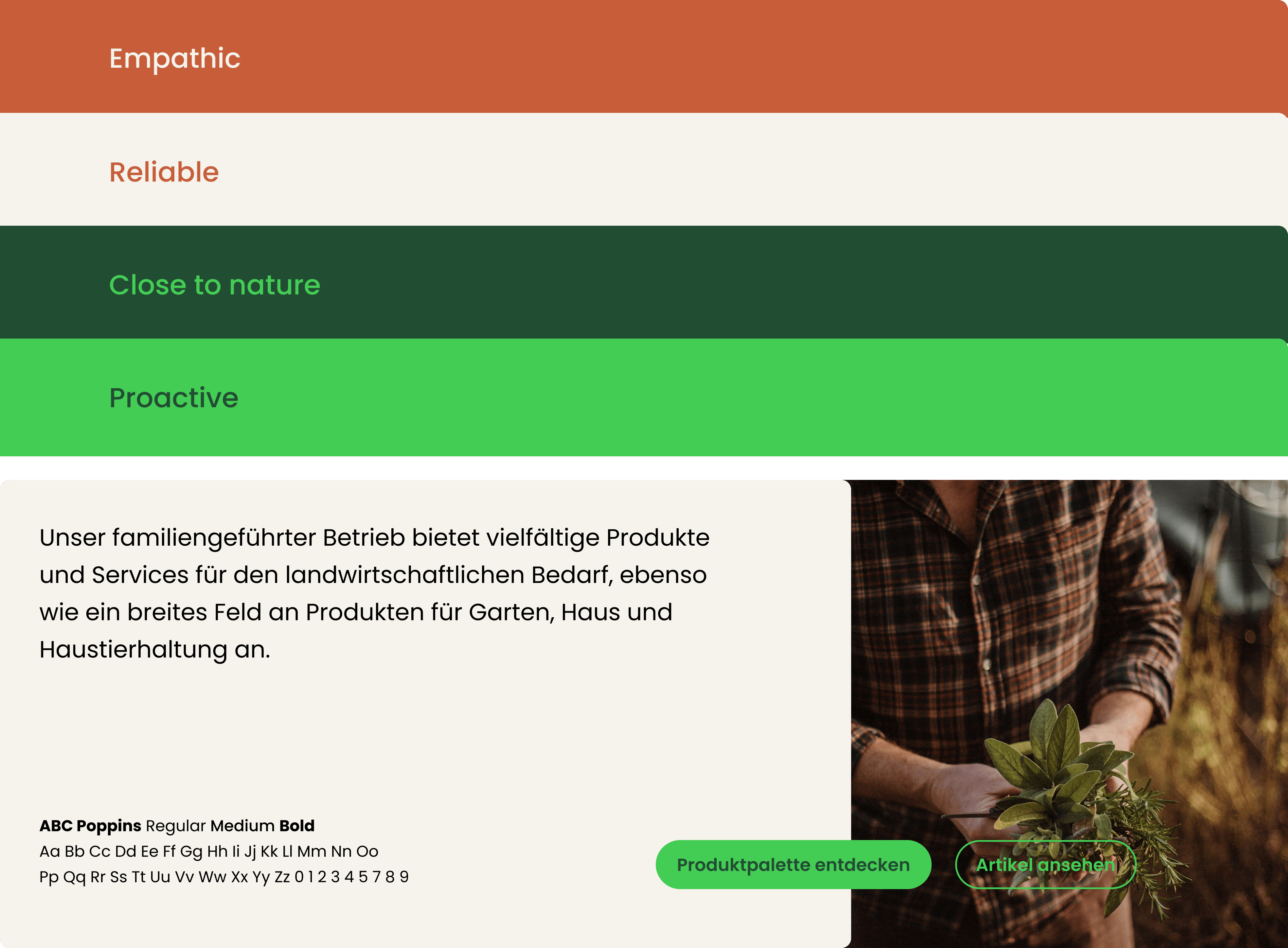
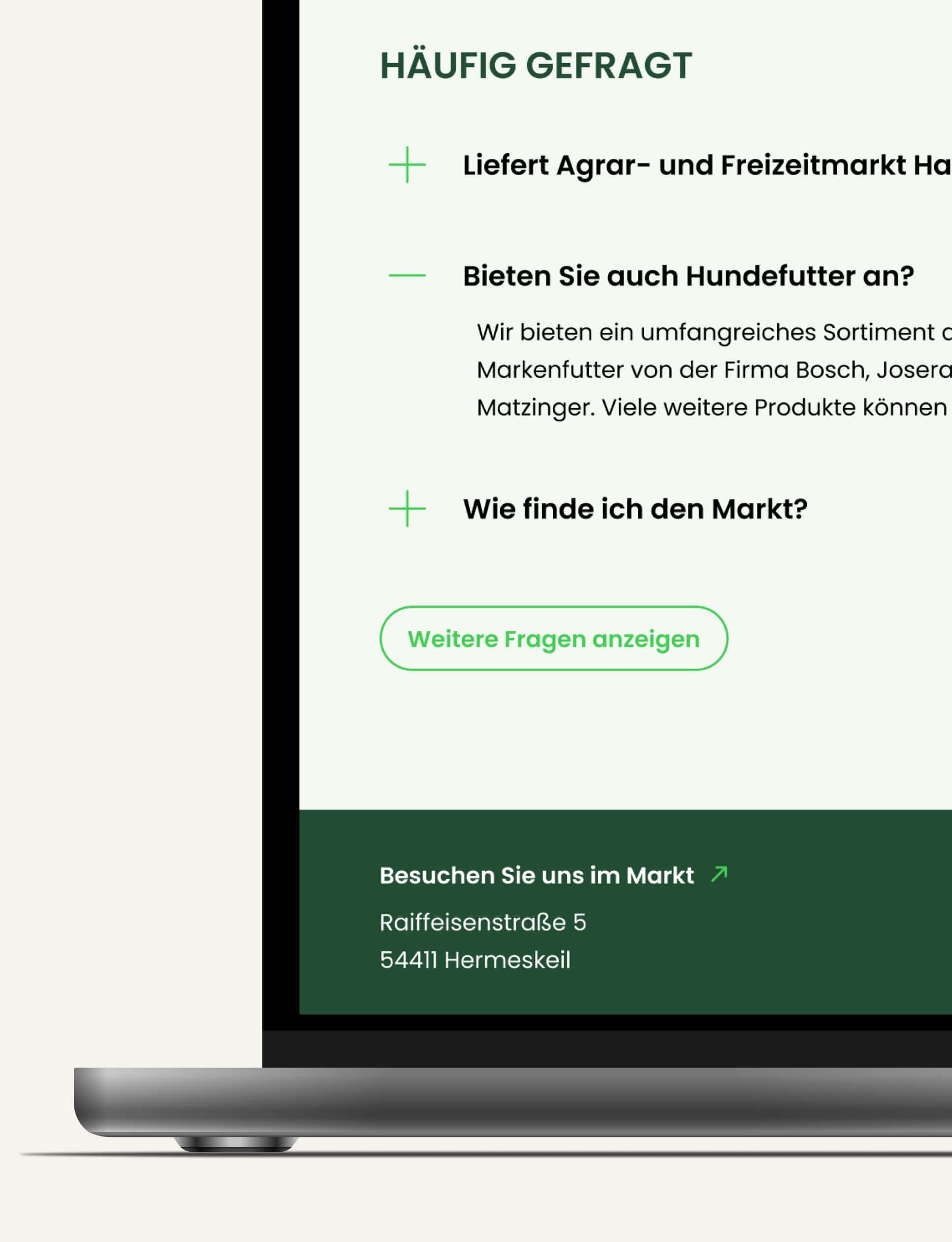
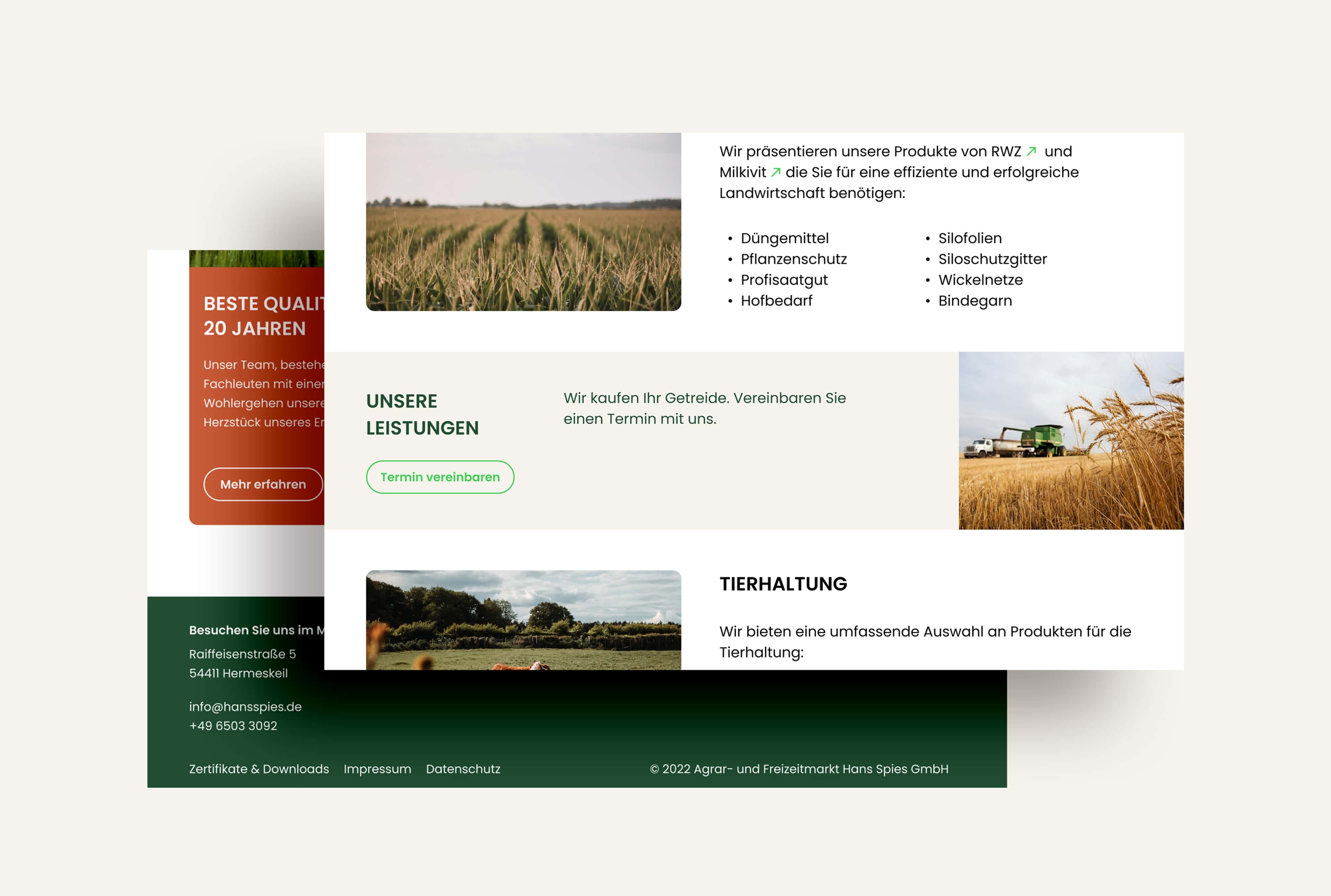
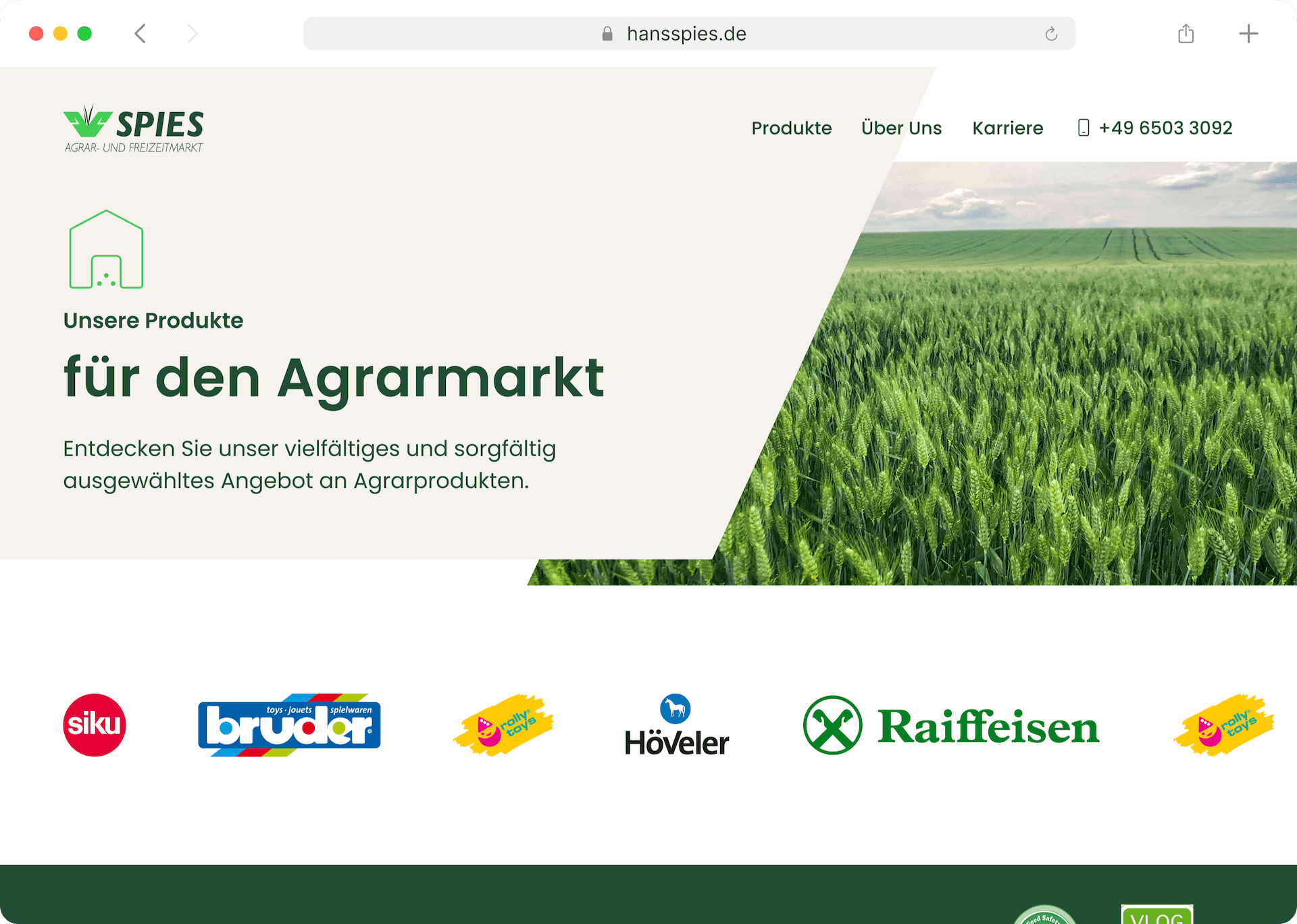
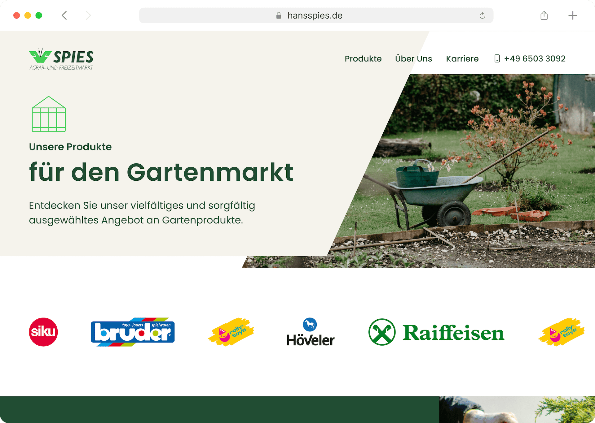
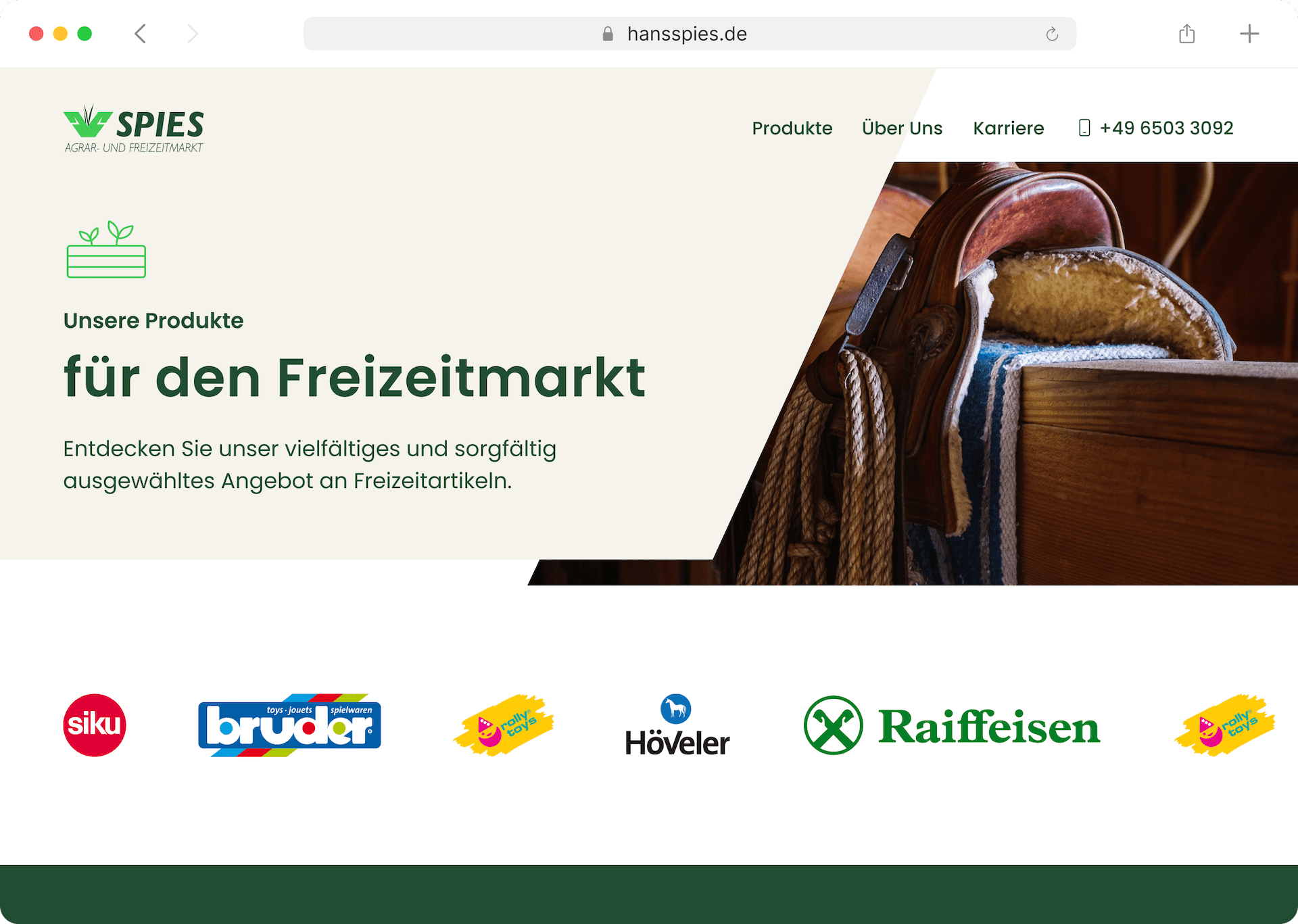
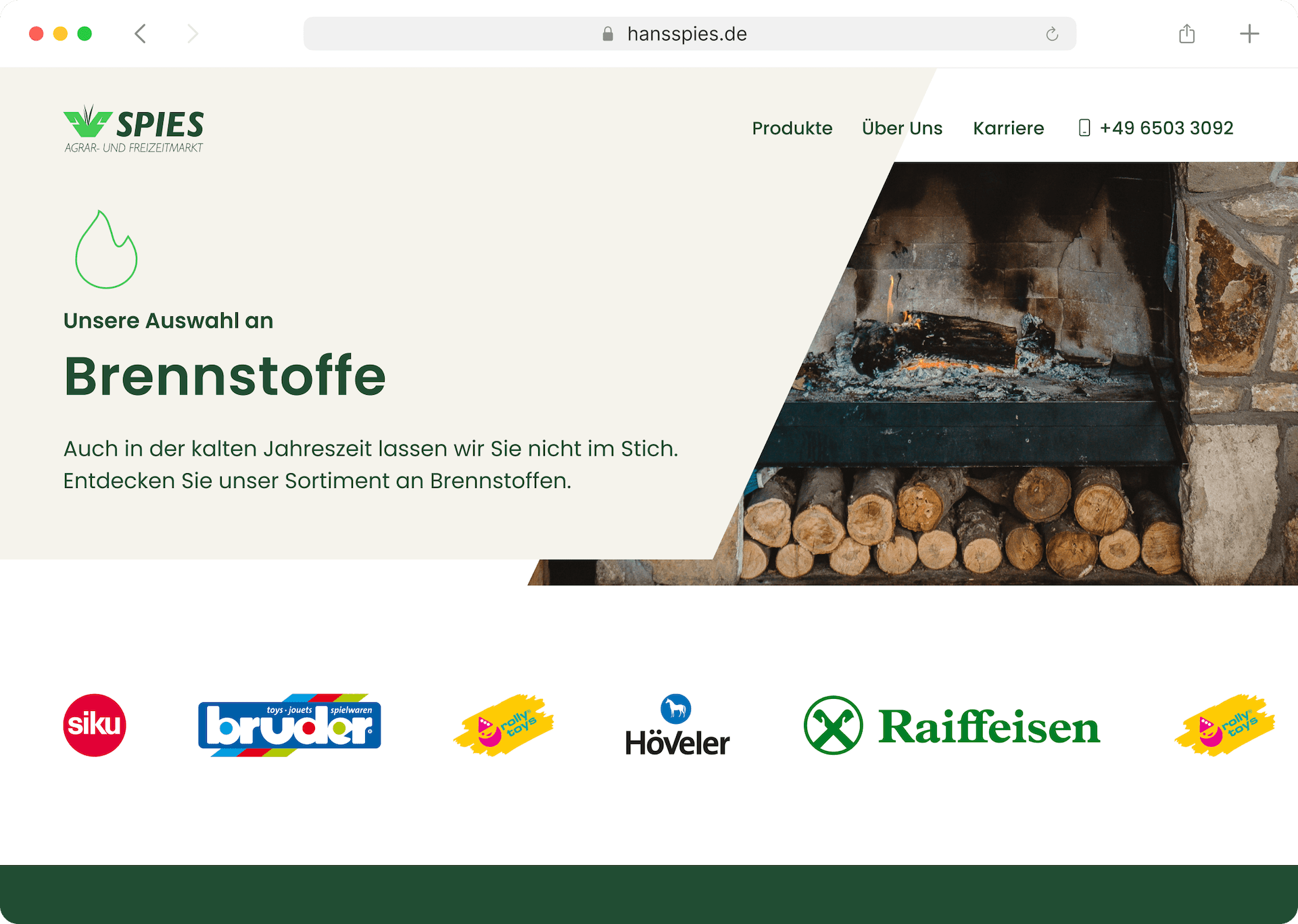
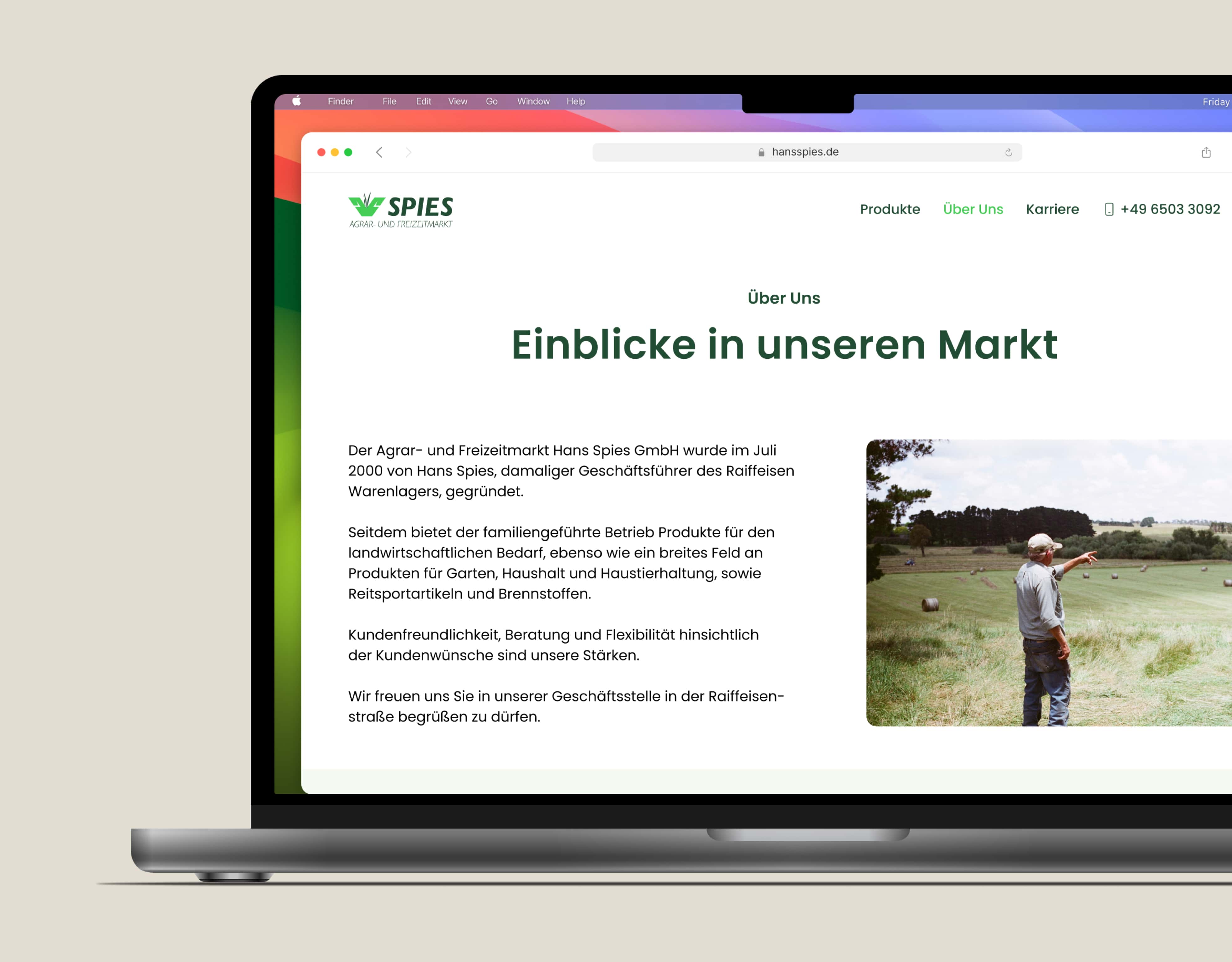
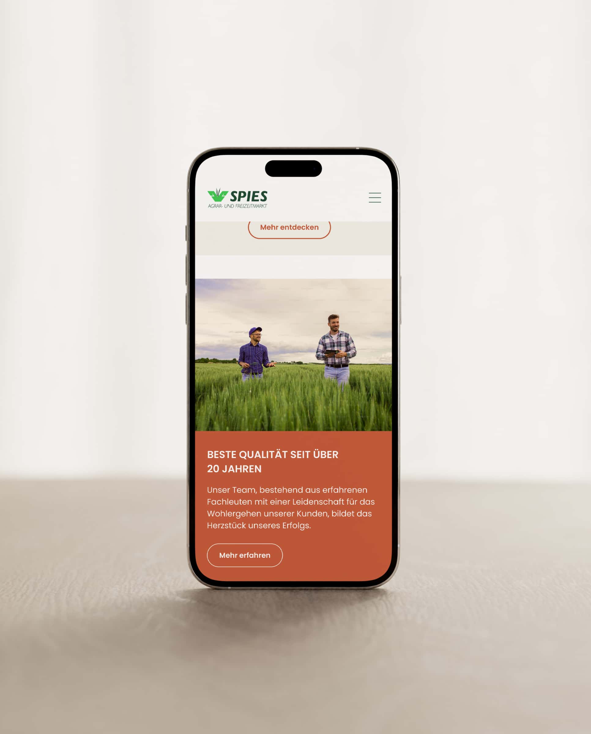
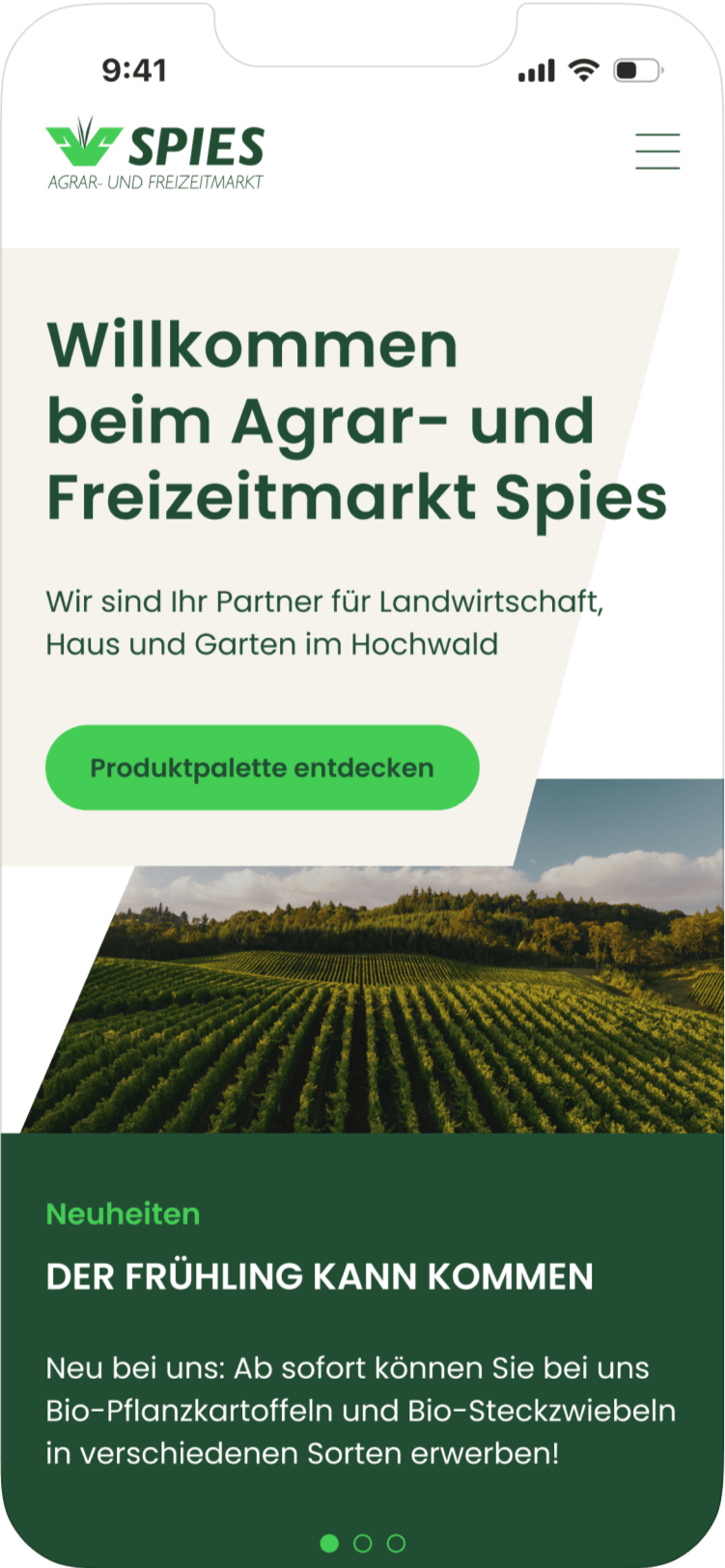
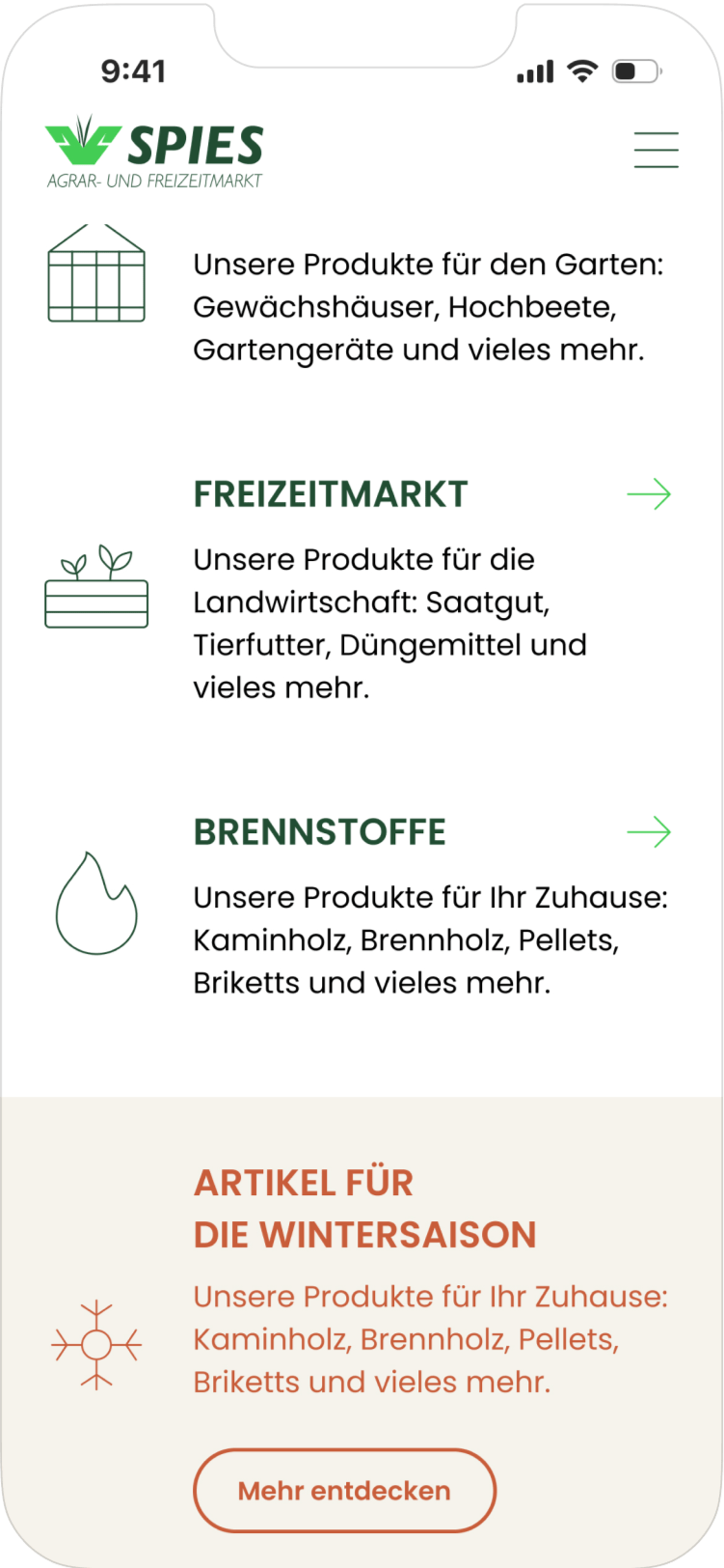
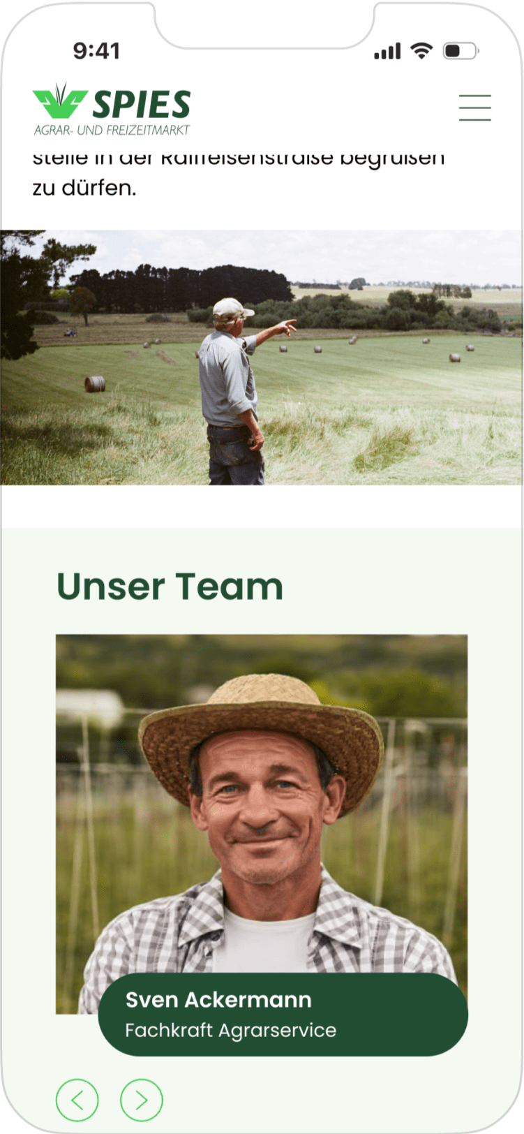
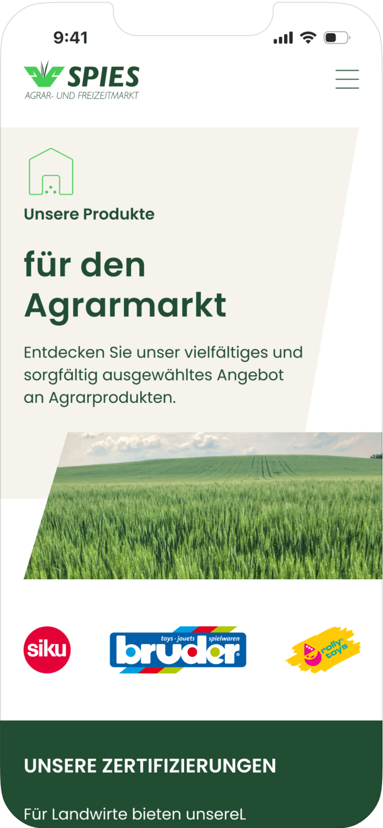
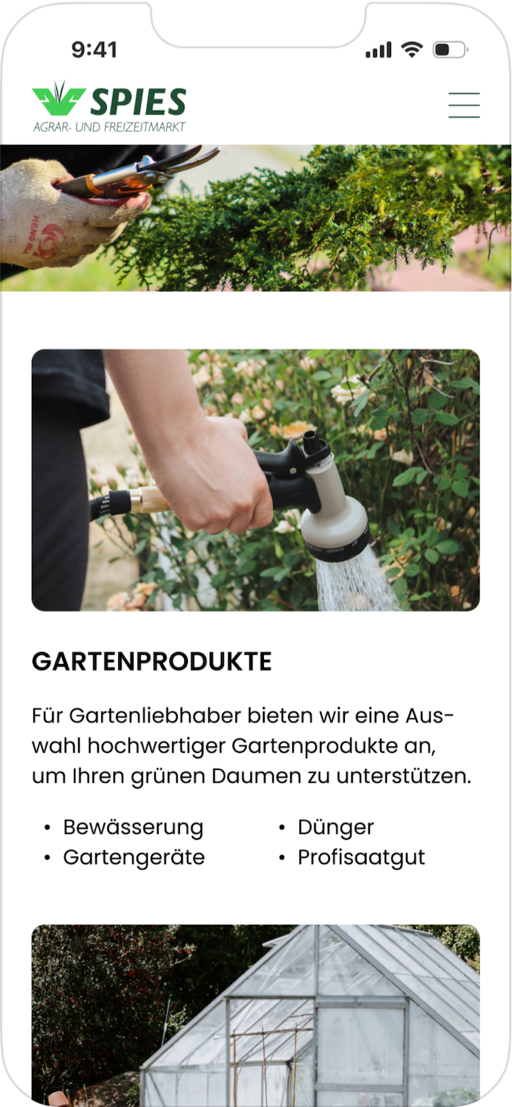
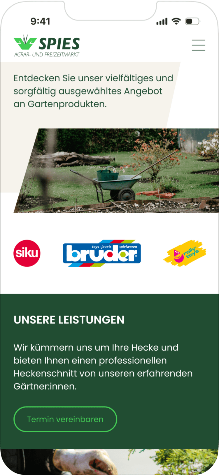
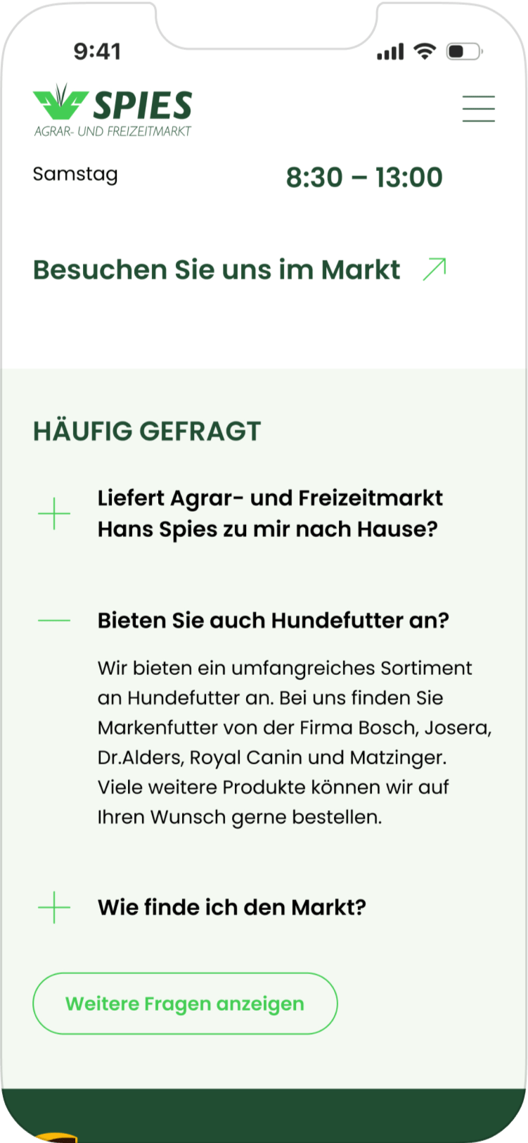
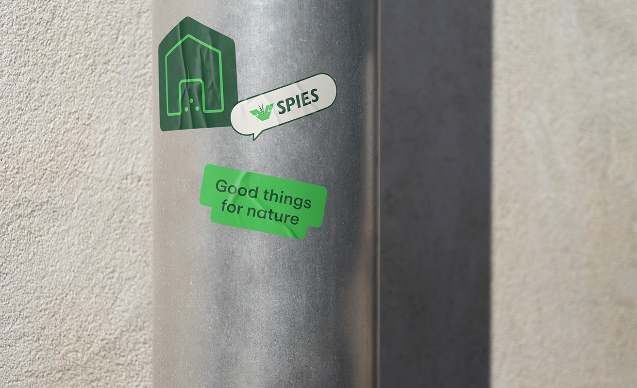
By combining natural imagery, a warm and inviting color palette, and clear hierarchies in typography, color, and graphics, we aimed to give the company a more approachable and modern feel. However, to honor its heritage, we retained the original logo. An emotionally driven visual approach reinforces key brand attributes like authenticity while creating a strong connection to agriculture. Rounded, friendly icons and ample white space enhance navigation, giving the website a clean, logical structure.

(results)
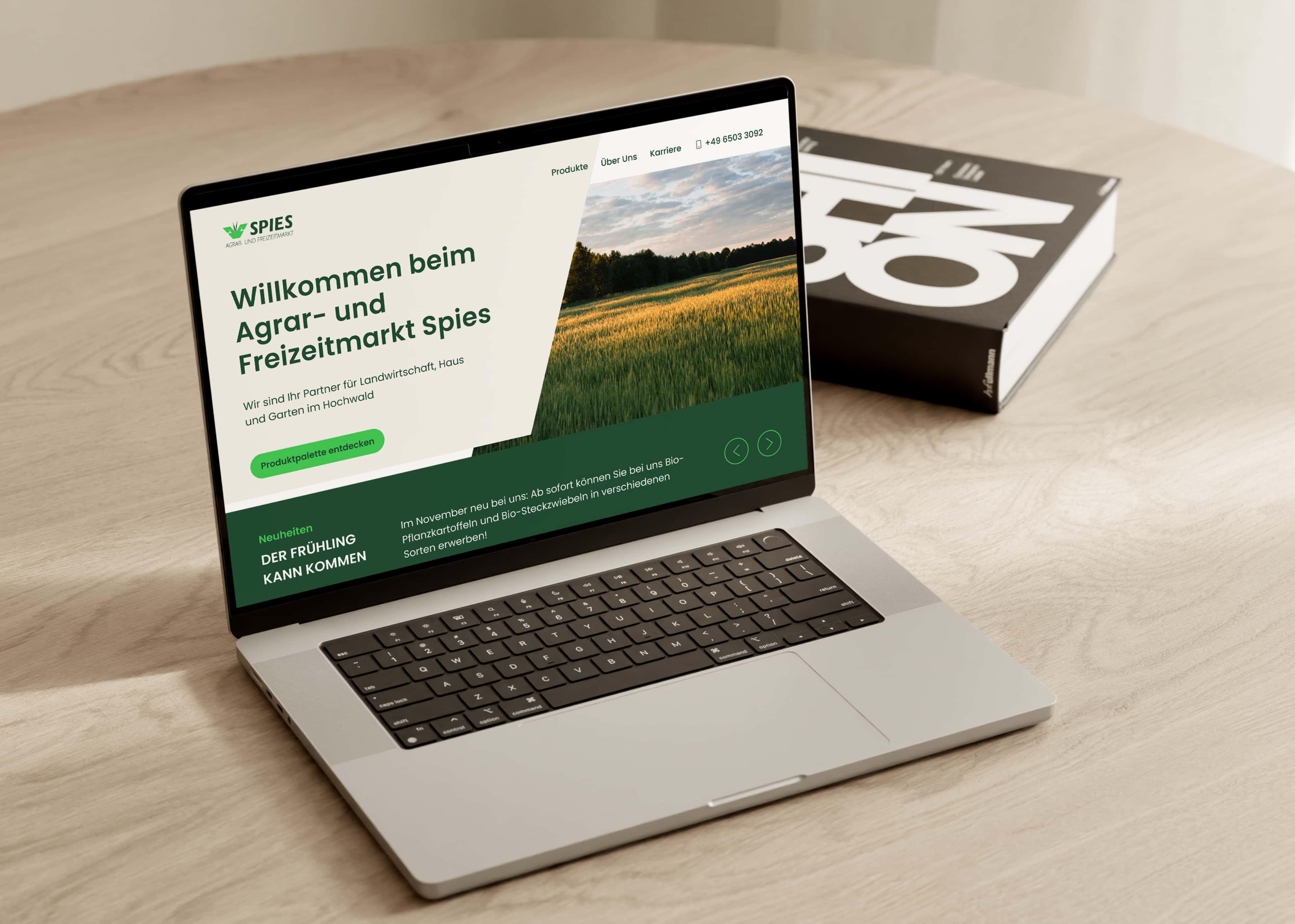
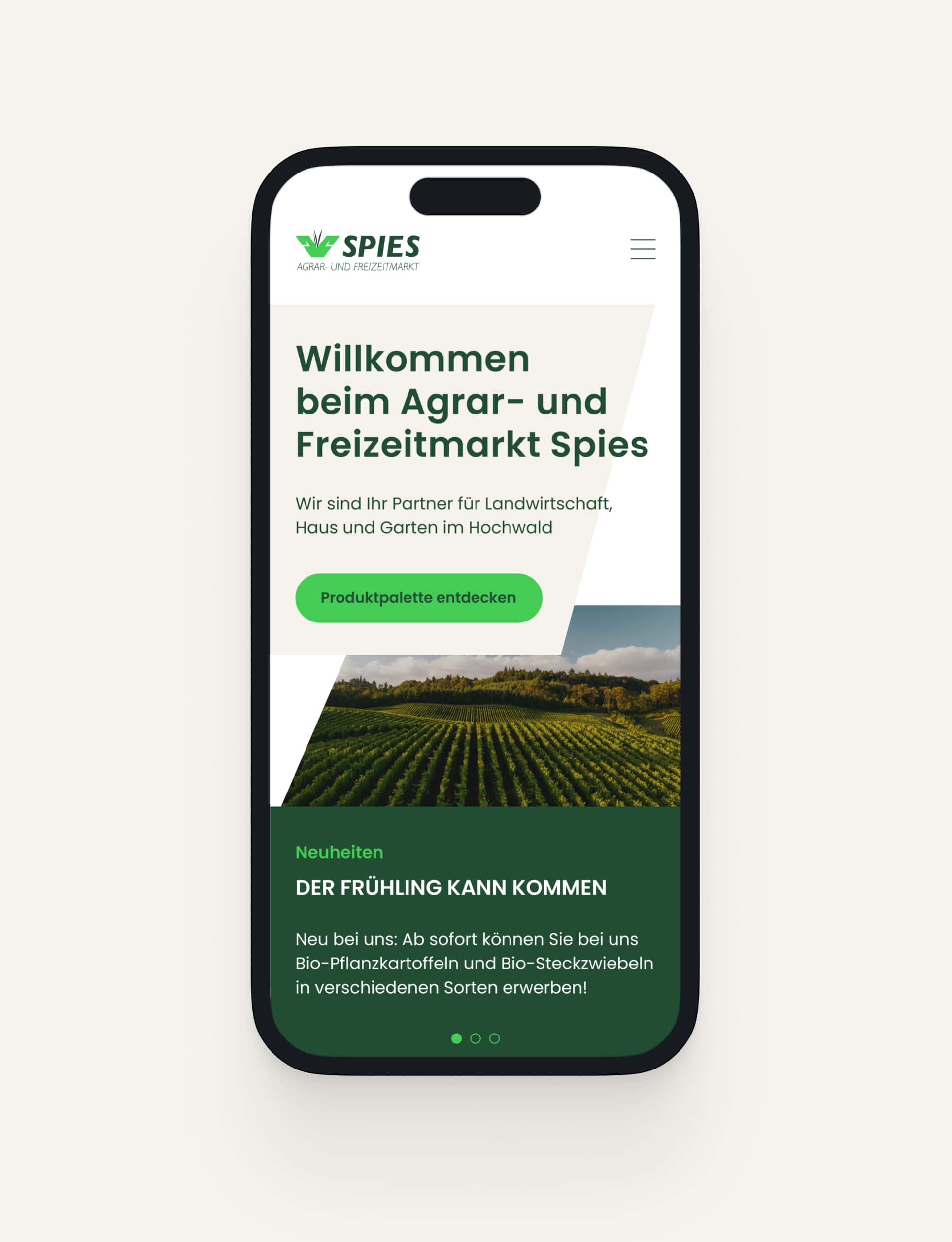
Hans Spies embodies reliability, trust, and consistency — values we aimed to bring to life on the website. By showcasing the company’s diverse product range in a clear, approachable way and incorporating subtle micro-interactions, we created a seamless user experience. Simple navigation, well-structured product categories, and a modern visual design set Hans Spies apart from competitors, making the brand both distinctive and engaging.
blending tradition and innovation into a fresh brand identity

Hans Spies is a family-run agricultural business with deep-rooted traditions, guided by the philosophy: "The best things are closer than you realize." Passed down through generations, the company specializes in products not only for agriculture but also for home and garden, combining heritage with practical solutions.
(strategy)
During a discovery workshop, we explored benchmarks, potential target audiences, and envisioned the brand as a person. We developed brand filters and defined key personas, shaping a clear identity for Hans Spies, one rooted in authenticity, reliability, and professionalism. Our goal was to reflect these qualities through a design that feels natural, friendly, and emotionally engaging, all while maintaining the brand’s rich, cross-generational tradition.
Branding
UI Design
Design System
(mood)

Caring
Authentic
Logical
(design)
By combining natural imagery, a warm and inviting color palette, and clear hierarchies in typography, color, and graphics, we aimed to give the company a more approachable and modern feel. However, to honor its heritage, we retained the original logo. An emotionally driven visual approach reinforces key brand attributes like authenticity while creating a strong connection to agriculture. Rounded, friendly icons and ample white space enhance navigation, giving the website a clean, logical structure.


(results)
Hans Spies embodies reliability, trust, and consistency — values we aimed to bring to life on the website. By showcasing the company’s diverse product range in a clear, approachable way and incorporating subtle micro-interactions, we created a seamless user experience. Simple navigation, well-structured product categories, and a modern visual design set Hans Spies apart from competitors, making the brand both distinctive and engaging.


©2025 all rights reserved legals
(up to top)
(let's chat)
©2024 all rights reserved
(up to top)